Responsive Design is an approach in digital product design aimed at creating a consistent and usable experience across a wide range of devices and screen sizes. Today, users access online services from mobile phones, tablets, laptops, and large monitors. Therefore, a successful product must be able to display well on all these devices without compromising user experience quality, and interaction with it must remain simple.
Alongside responsive design, the "Mobile-First" approach has gained special importance. In this method, design is first done for the smallest screen, i.e., mobile, and then extended to larger devices. This approach makes designers focus first on the most important content and core functionalities, avoiding unnecessary complexities.
In responsive design, user interface elements such as images, columns, menus, and content sections are designed to adapt their structure as the screen size changes. For example, a page may have multiple columns in the desktop version but become a single column on mobile to maintain readability and user access. This flexibility allows users to easily use the product without needing to zoom or scroll horizontally.
- Designing based on the smallest display (Mobile-First)
- Using flexible Grids
- Optimizing images and media for different sizes
- Adapting navigation and menus to different devices
- Maintaining readability and accessibility across all screen sizes
One of the important advantages of mobile-first design is that the design team's focus remains on the real priorities of the product. When design starts from mobile, the designer is forced to place only essential elements on the screen. Then, in larger versions, more capabilities or additional details can be added. This approach helps create a simpler, faster, and more efficient user interface.
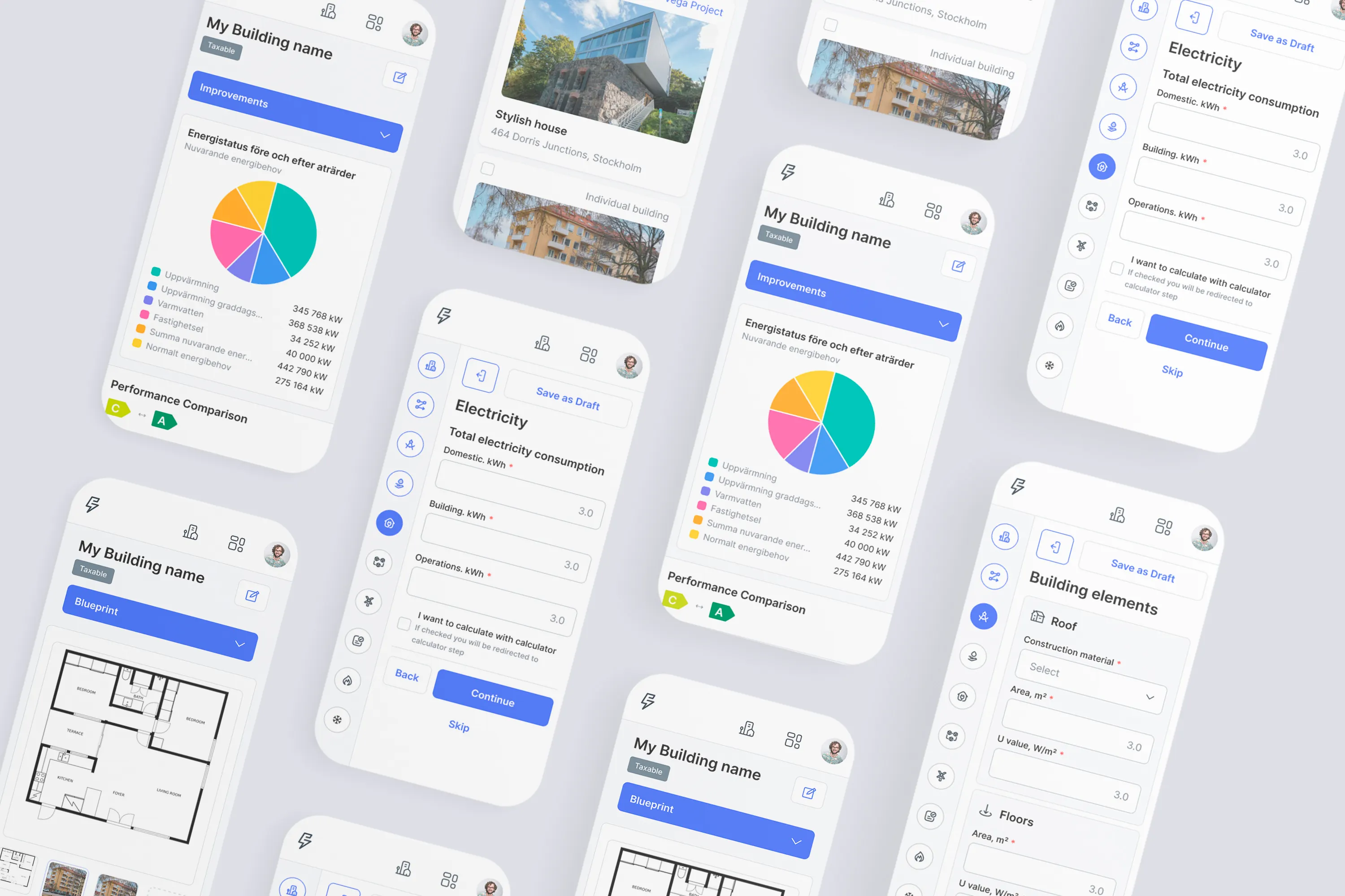
Technically, responsive design is typically implemented using flexible Grids, Media Queries, and modern design systems. At the design stage, designers must consider different Breakpoints to ensure that the user interface displays correctly at different screen sizes.
Ultimately, responsive and mobile-first design not only improves user experience but also has a direct impact on product performance in search engines and user engagement rates. Given that a large portion of internet users access websites via mobile, having a mobile-compatible design has become a necessity for the success of digital products.